


Autumn photo shoot at Birkensee: Olive. Beige. Rust. Three tones in nature
Autumn shoot at Birkensee – three tones, one attitude
For our autumn shoot, we went to where our colours originate: nature. With Olive, Beige, and Rust, we show how our designs organically integrate into living spaces, calm, clear, and confident.

Olive – Focus from nature
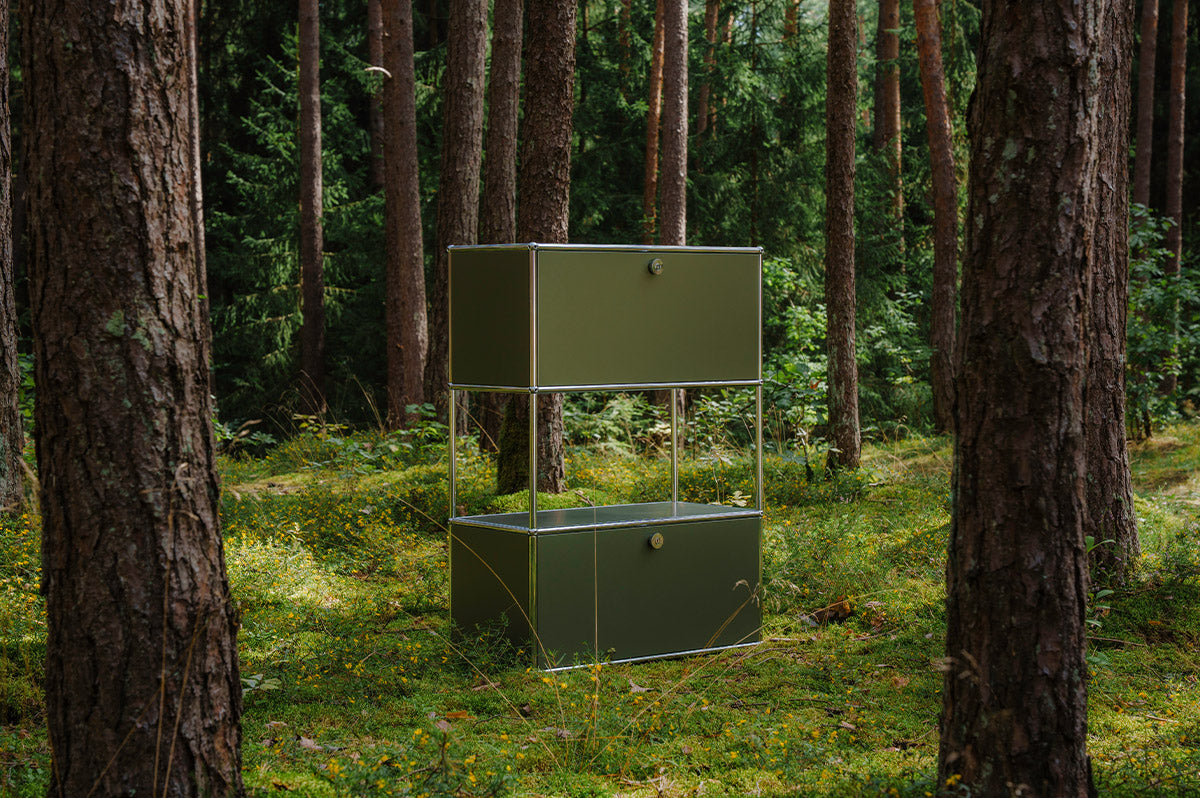
Olive brings the depth and serenity of the forest into the workspace. In open-plan offices as well as home offices, the tone has a concentrating effect, without becoming harsh. Presented monochromatically, it shows that structure can recede while still providing orientation.

Beige – Clarity in every light
Beige reflects light and creates calm in the room. The tone acts as a neutral canvas for thoughts and ideas. Precise lines, matte surfaces, and a harmonious transition to the surroundings make Beige the basis for harmonious design.

Rust – Warmth with character
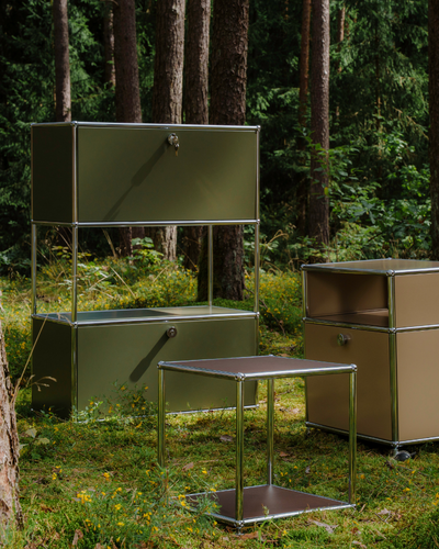
Rust sets deliberate accents. Warm, durable, and approachable, the tone gives rooms depth and character, without being loud. A subtle contrast to nature and precisely for that reason, a strong design statement.

Behind the Scenes
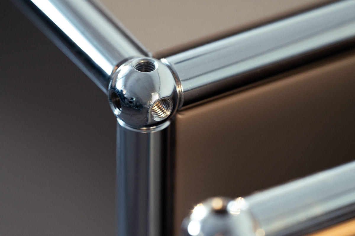
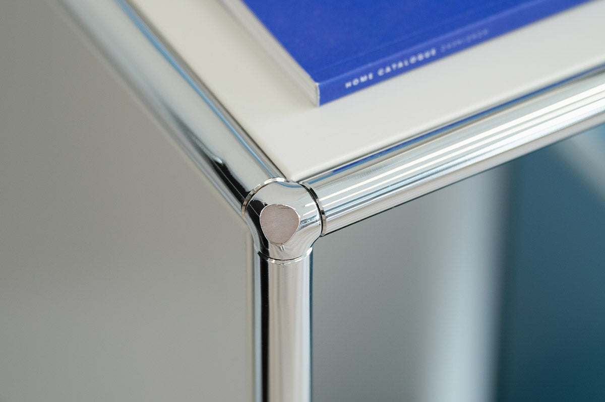
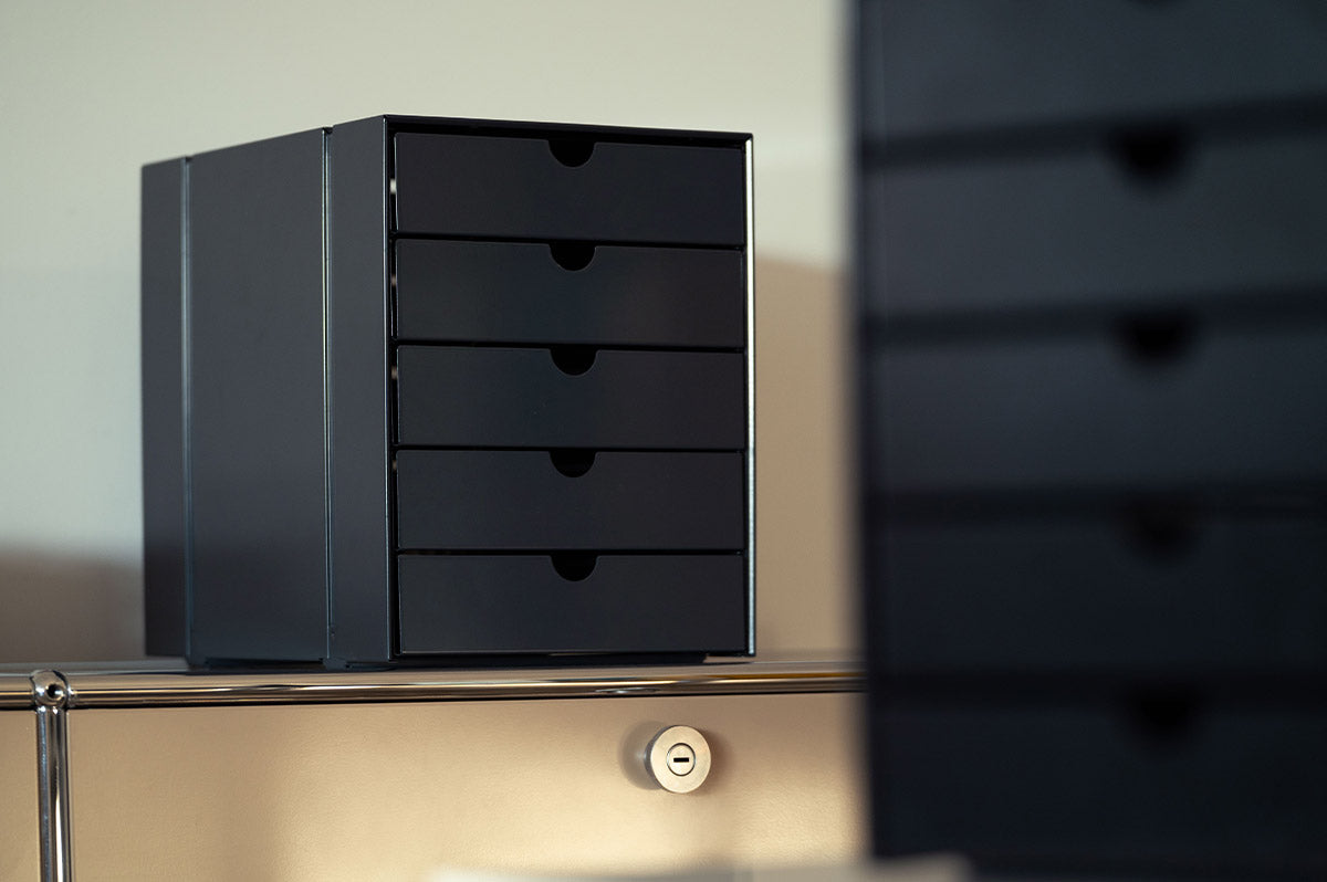
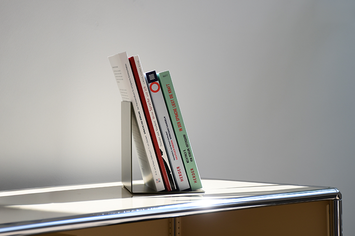
For our autumn shoot at Birkensee, we wanted to showcase the colours Olive, Beige, and Rust as they appear in real spaces. Calm, high-quality, and clear. To achieve this, we worked with targeted lighting.
The natural environment provided the perfect backdrop. Soft greens, natural textures, and muted tones. Our lighting supported this look, highlighted contrasts, and made the quality of the matte surfaces visible.
The focus was on perspective, balance, and lighting. Every scene reflects the attitude that konektra stands for. Clean lines, harmonious atmosphere, and modern work environments with a calm expression.

Natural Concentration
The scene at Birkensee shows that our colours are more than just a sur